Kemira.com
Makeover the official digital channel to solve complex architectural setups and improve accessibility & usability
Task
To lead the kemira.com reimplementation design from brand experience, and accessibility point of view. Ensure that the design is implemented accordingly. And establish a design system within the kemira.com reimplementation project.


Carousel hero area
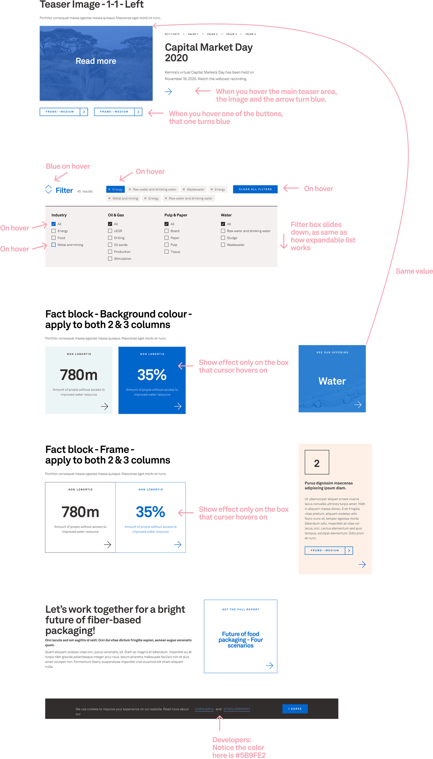
 Teaser hero
 Section with background colour
 Section with background image
 Hero with background image
 Factblocks
 Tagging system
 Teaser carousel
 Tile banner


Homepage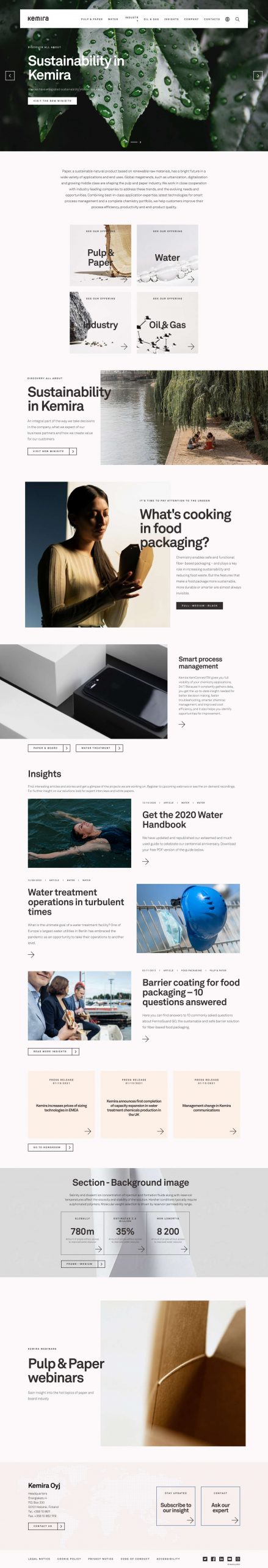
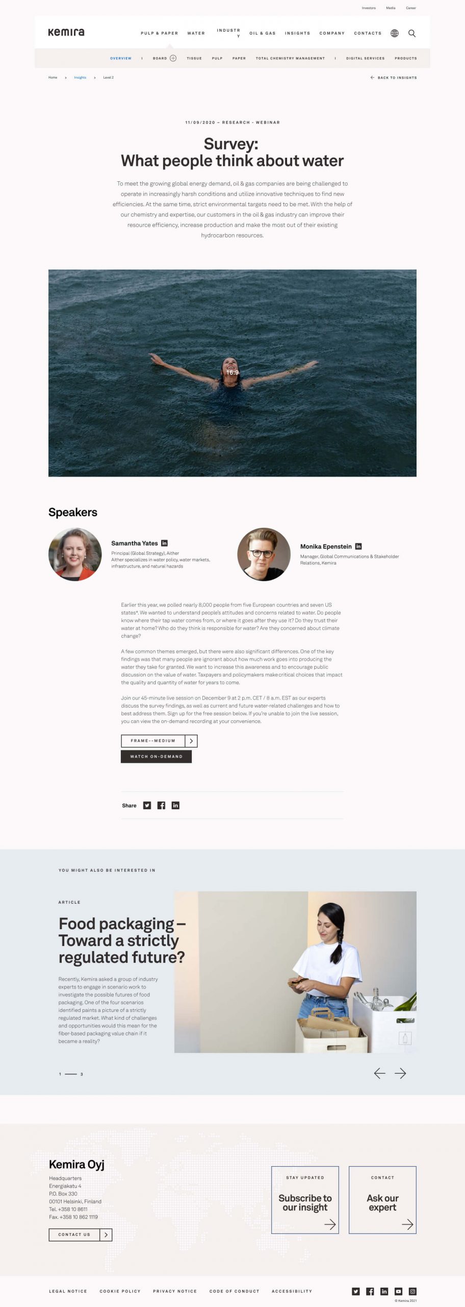
Insights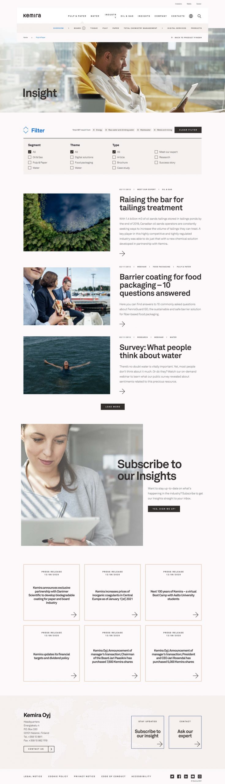
Future of food packaging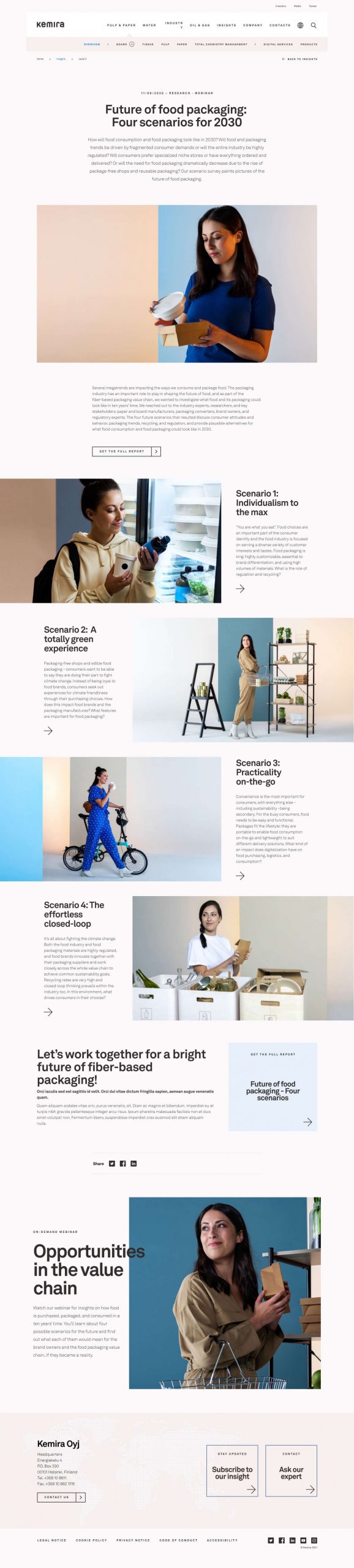
Investors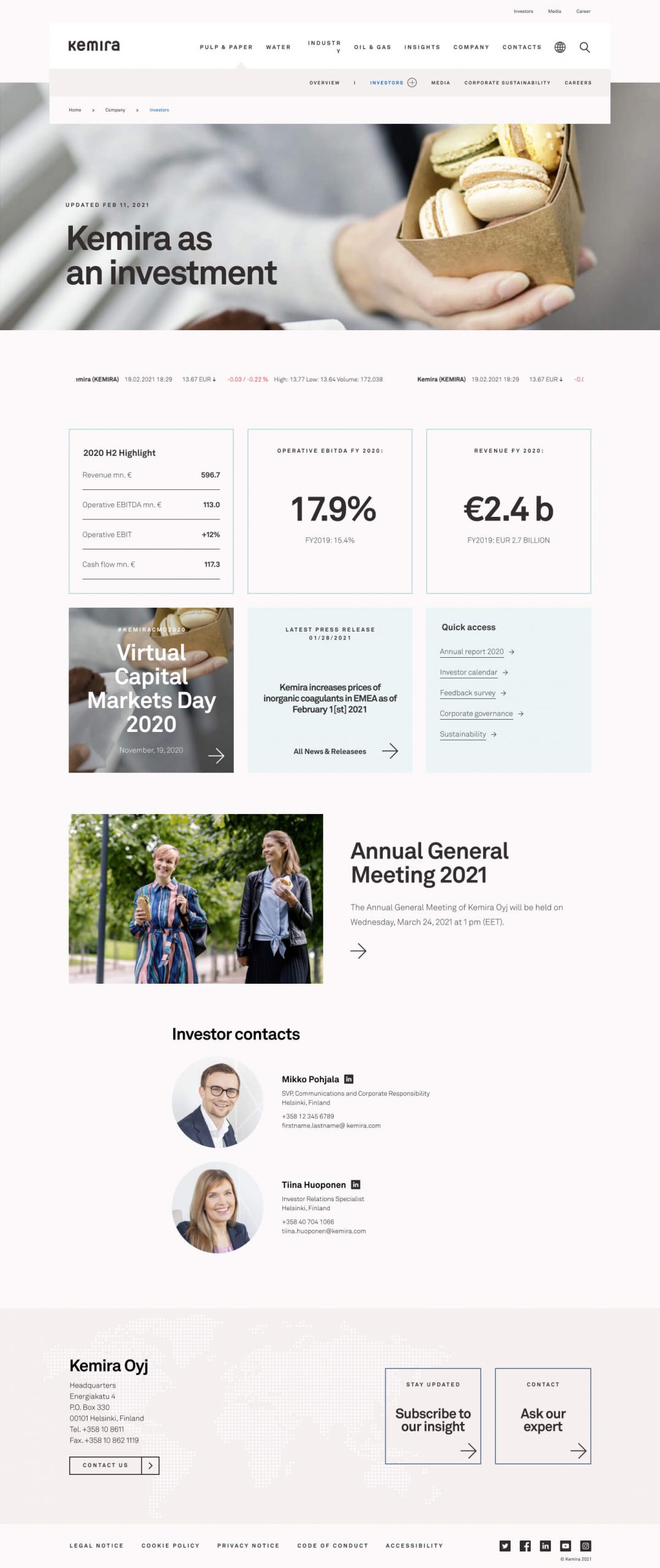
Investors - Alternative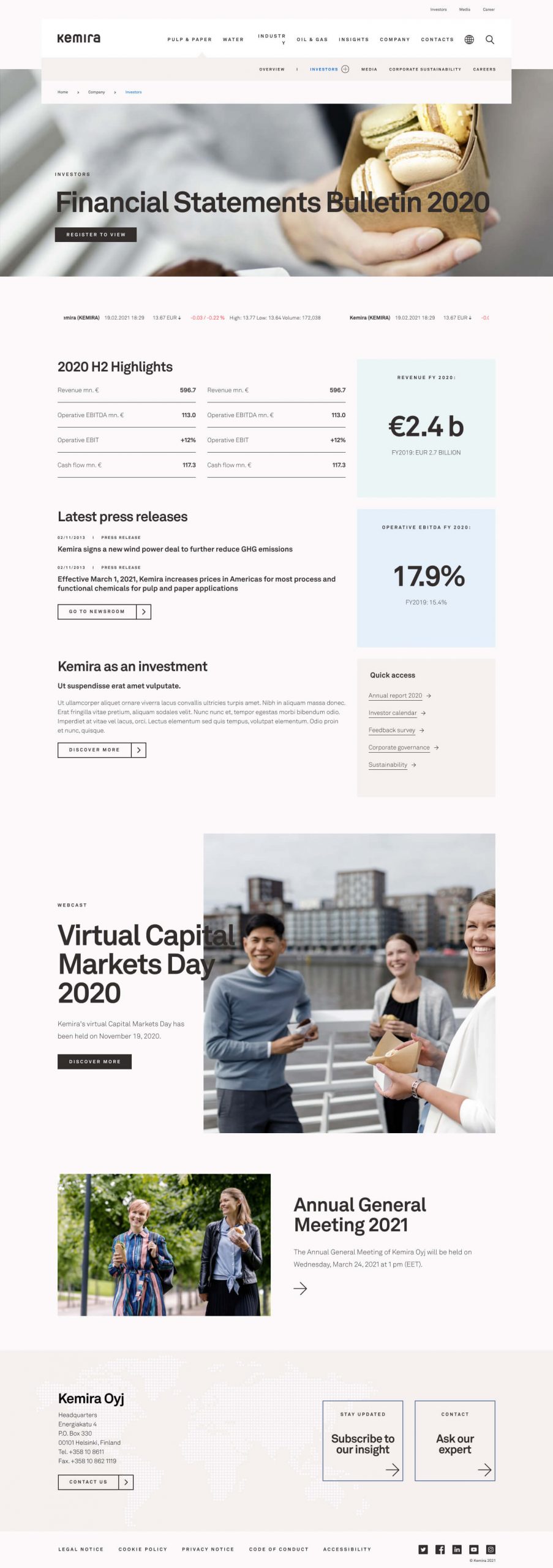
News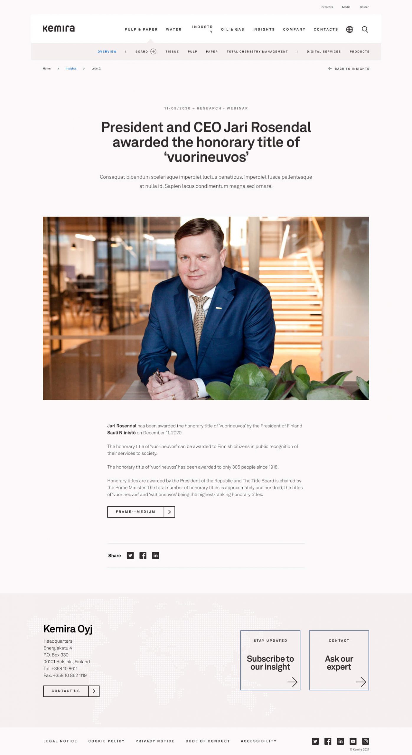
Article