Kemira Visual December 1, 2021

Annual Report 2021

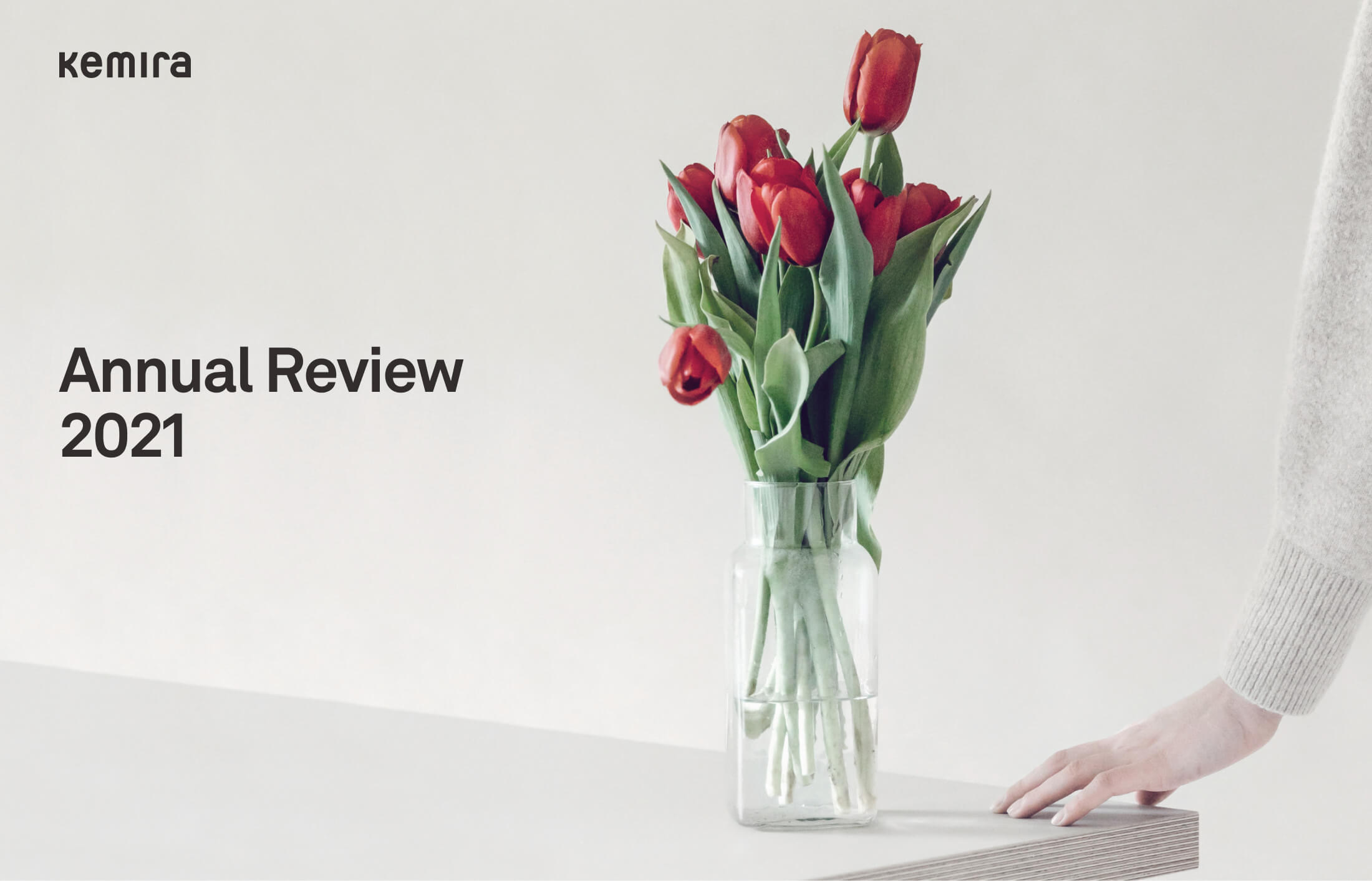
I addressed a design system to safeguard Kemira’s brand consistency and design quality in the reports released to the investors annually.

Task

To establish a unified, on-brand visual system for the Annual Report, to be used by the graphic designers & creatives in future releases.
  • Strategy

    Brand, UX Strategy

  • Design

    Art Direction, Layout

  • Client

    Kemira Oyj

Open Project
Challenge

Make a digital and print presence of Kemira's Annual Report to always be engaging

Reports tended to consist of facts and figures along with a fact-focused presentation of what the company had accomplished over the past year – created by the collaboration of multiple teams, internally and externally. Visual consistency had always been known but not addressed systematically.

What I do

Created a design framework that strengthened the brand's identity and elevated production efficiency.

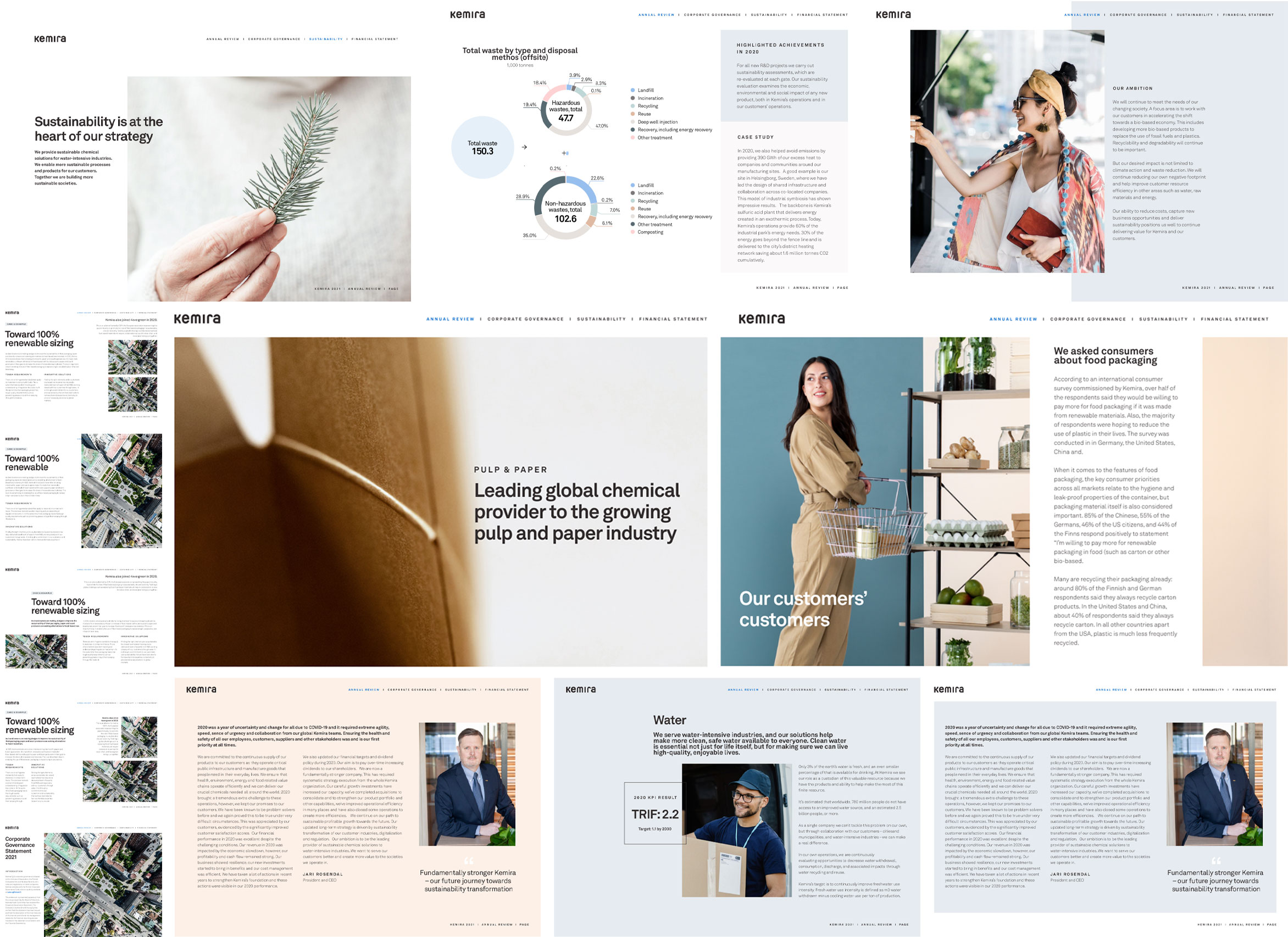
Good design in Annual Reports can help tell the stories and, at the same time, humanise the brand and build a connection with the audience. In this project, I led the design and established a thought-through framework from the ground to ensure that in future releases of Kemira’s Annual Reports, not only will it convey a consistent visual experience, but the framework itself will also provide the comprehensive system that designers and creatives can conveniently utilise. This will help cut back the production time and the team can focus on other aspects of the creation.

Grid-based system

The whole visual journey throughout the document is built upon this grid system. Key critical lines are specified to align the focus elements on the page. The 12-column grid system provides possibilities to handle multiple combinations of displaying information, data, imagery, and graphics together. Designers have the freedom to arrange how to occupy the space.

Imagery

Annual reviews can sometimes be too text-heavy. Imagery does an excellent job of balancing out visuals and writing. At the same time, imagery can relate to the value of the brand within a quick glance. I created a visual colour mapping to define the key colour spectrum that reflects Kemira’s official brand colours, and used it as a guide to select images to be used throughout the document in harmony with the colours.

Typography

I established only 7 different scales of typography to be used in this framework. These make the document less cluttered, and lightweight. When combined with visuals, they make it effortless in juxtapositioning with different elements.

Infographic & graphs

Good infographics and charts can help put information into a snapshot that is easy to understand. I defined the necessary specifications for creating elements in infographics and graphs. While doing that, I also left designers the needed freedom in how to manipulate the measurements to accommodate their creativity.

Layout design

Back